notes
- 6 min
Clickable should look clickable
A card with a click handler on a div works in code and goes unfound on screen. Give it a signifier, build it as a real link, then ask a new teammate to point.
- 5 min
Your customers learned your navigation somewhere else
Jakob's Law, the five moves people make without reading a label, and why an agent that can redesign a layout in an afternoon makes them matter more.
- 5 min
Your product has two models
Your Archive button restores perfectly, and your customer still thinks it deletes. Norman named the gap in 1988, and the cheapest fix is usually one word.
- 5 min
Your explanation doesn't ship with the product
AI made shipping cheap and left understanding as slow as it was. Why the team and the user see two different products, the silent session that finds the gap, and when a hesitation is not worth a redesign.
- 4 min
The questions were the variable
Same model, same options: rewording five decisions moved the top answer by 20 to 64 points. The gains were in the questions, not in the model.
- 3 min
Enterprise design slop keeps getting a pass
AI dashboards, shadcn defaults and the customer left figuring it all out: why I keep pushing for design attention.
- 3 min
Vibe coding a landing page together
Build a landing page with AI through a worked brief, page outline and review notes, keeping people in charge of the content and design decisions.
- 3 min
Make AI-generated UI look custom
Choose a direction, give your LLM specific feedback and keep the design decisions that work.
- 6 min
Three AI agents agreed. The human disagreed. Only half of that argument could be settled without taste.
One restaurant brief, three AI proposals that agreed with each other, and a reference deck asking for the opposite. Which half of that argument arithmetic settled, and which half needed a person.
- 5 min
We put numbers on "looks expensive"
Four measurable thresholds behind premium-looking design, with all seventeen of our themes scored against them, including the one that fails.
- 2 min
The cache is the release
Fable 5.1 cuts cache-read prices by 75%. For long-running coding agents, that matters more than the benchmark chart and changes what context costs.
- 4 min
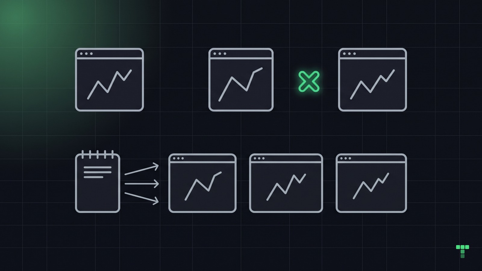
A dashboard is a set of numbers that must agree. Design the model that makes them agree first.
Roles, the job each one has, one route per job, and one source for every figure. The product model behind a dashboard that holds up, and the five contradictions ours shipped when the model was half done.
- 4 min
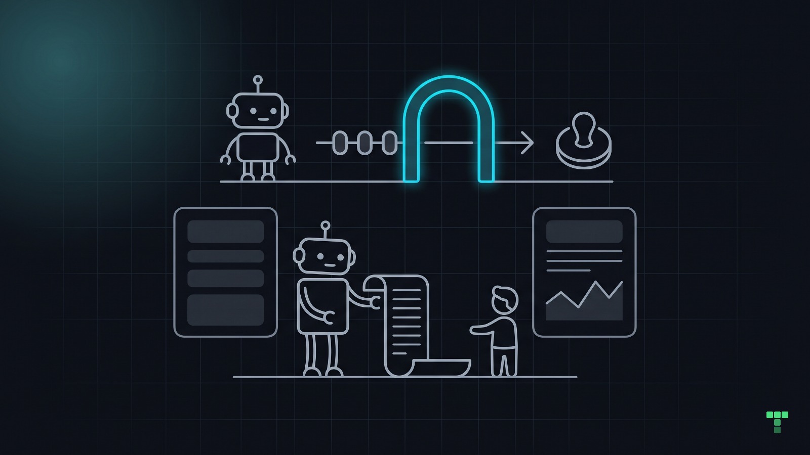
Tailwind won the agents because a class is a sentence a machine can read.
Utility classes are a closed vocabulary: dense in the training data, colocated with the markup, cheap for a linter to check. Why agents default to it, what that does to the look of generated UI, and the numbers from our own catalog.
- 6 min
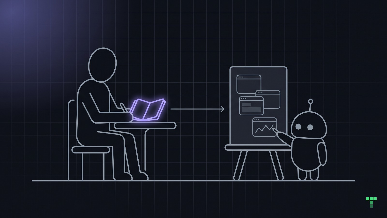
What a designer makes when the machine makes the screens
Claude Design, Anthropic's frontend-design skill and our own pass files all ask for the same document before the first screen. What is in it, and what it did to our review loops, counted.
- 7 min
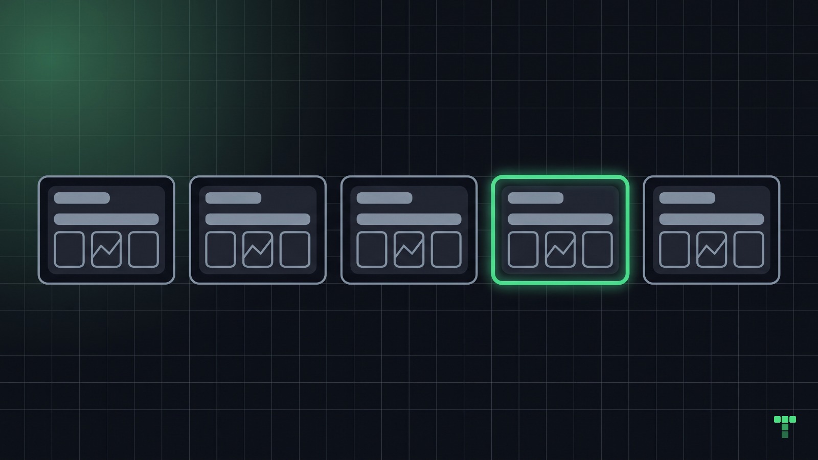
Five things make agent-built UI look generic. Each takes 30 seconds to check.
We measured them on our own catalog. Seven AI-generated themes, seven independent critiques, six scored 6.5 out of 10 and the failures repeated. Here is each one, and how to test your own project for it.
New themes and notes
One mail when something ships.