If you approve design rather than build it, the hard case is the one nobody can prove wrong. We gave one restaurant brief to three AI agents, separately, and all three refused the look the whole category wears: gold serif on a black page over a photograph of a plate. Then the owner sent reference images asking for exactly that.
Every theme here is generated by an agent and checked against a written bar, so when the machine half and the human half disagree it gets written down rather than settled by rank. This is the clearest disagreement on record, and it happened over a 46-seat dining room in Sheffield.
Both sides had a point. What settled it was a third thing in the room with no taste at all.
How can three agents agree and still not be evidence?
Before any code is written, a brief here goes to three agents at once. Each is handed a different lens to argue from: one takes the buyer's job, one takes the market position, one takes the material. None of them sees the others' work.
All three came back refusing gold-on-black. Then two of them picked the same background colour, and not a similar one.
Measured in OKLCH, a way of describing colour that tracks how an eye reads it rather than how a screen stores it, the two sat 0.009 apart in lightness and 13.6° apart in hue. That is a gap nobody can see.
It is tempting to read that as three experts reaching a conclusion. It is closer to one expert asked three times. Agreement between models trained on the same material tells you what the middle of that material believes, which is worth knowing and is not a fact about the market.
| The proposal | Its idea | What killed it | What survived into the theme |
|---|---|---|---|
| The menu | a card that still reads at 41 dishes | fonts we are not licensed to resell | its fonts, and its awkward test data |
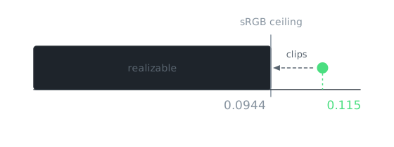
| The room | the dining room drawn to scale | a green no screen can make: 0.115 asked, 0.0944 possible | the whole idea |
| The plate | where the food came from, drawn as geometry | a repeat of work shipped the same week | its cool grey page |
check your own project
Take the last three options an agent gave you and put a number on how far apart they are: heading sizes, spacing steps, the main colour. If they land within a rounding error of each other, you were shown one option in three outfits, and the choice was made before you saw it.
What did the reference images know that the models did not?
The deck arrived the same day: dark pages, gold serif type, a full-bleed photograph of a plate, filed under "2026 trends". It asked for the exact look the three proposals had just thrown out.
Both were right, because the deck was making two claims and only one of them was about the look.
- The claim about the look was wrong, and checkable. Gold on black over a plate is what every competitor already opens with, and the reference we sampled had placeholder text and invented star ratings on it.
- The claim about atmosphere was right, and nobody had made it. A restaurant demo should make you hungry, and ours had no food in it at all.
That is what a reference deck usually is. It is evidence of a feeling, dressed as a specification, and the work is telling the two apart before you answer either.
So the theme got a four-dish shoot, lit like the room photographs already in it, placed in four sections and disclosed as AI-generated in the download. The look stayed refused. The drawing and the food never appear in the same section.
What settled it, if neither side could win on taste?
A pass that checks every proposal against the things that can be measured, before anyone builds anything. It is not a reviewer with opinions; it runs the same checks the publishing gate runs. On this brief it found:
- One proposal picked fonts we are not allowed to resell, and every theme here ships as a zip somebody buys.
- One picked a green that does not exist, asking for more colour than a screen can produce, which browsers answer by quietly substituting the nearest one they can.
- One argued for a text column 32 characters wide, using a menu whose own longest dish name is 46.
- Two invented restaurants on a street that a theme we already sell is set on.
- All three claimed permission to break a house rule, and none of the three had it.
The font problem alone would have cost a day of building before anyone noticed it. None of these is a matter of taste, and that is the point. This is the part of design review that neither a model's confidence nor a client's mood board can reach, and it is the cheapest part to hand to a machine.
Run this on your own design system
Go through your colour and type settings and ask of each one what would go wrong if the value were slightly off: a contrast ratio, a licence, a colour no screen can make, a duplicate of something you already shipped. Every answer you can write down as a rule is one you never have to review by eye again.
What shipped, and what did the losing proposals leave behind?
The room plan won. The theme draws the dining room from above, out of the same file that fills the menu, so how many people it seats, which tables can be booked online and whether you can reach the accessible toilet without a step are drawn rather than claimed.
Both losing proposals are inside it:
- The menu proposal's fonts, which were also the fix for the licence problem, plus the deliberately awkward test data it wrote.
- The plate proposal's refusal of the category's warmth, which is why the page shipped a cool grey where every competitor is cream, terracotta or black.
Six pages, and one deliberate rule-break: heading sizes that step by √2 rather than the house ratio, tested by putting the house ratio back and looking at both. It is live as Covers.
The reference direction was not thrown away either. It is logged as a candidate for a second restaurant theme, dark and atmosphere-led, which has to earn its own search term before anyone writes a brief for it.
Where does this break?
Our human is also the person paying for it. "Your references are the thing everybody already sells" is a cheap sentence to send when the person reading it owns the business. Sent to a client with a deadline, the same diagnosis needs a mock-up attached, not a paragraph.
Agreement is only a signal when the lenses were genuinely different. Ours were assigned to differ and two still landed on the same colour. Three vague prompts would converge for a boring reason, and reading that the same way would be wrong.
The atmosphere fix was cheap. Generated pictures cost us an afternoon. Had it needed a photographer and a day in a kitchen, that argument would have been decided by the budget rather than by the diagnosis.
One theme, one debate, one operator, over two days. The measured findings are logged and can be run again. Reading the deck as two separate claims was a judgment call that happened to be checkable this time, and that is the limit of it.