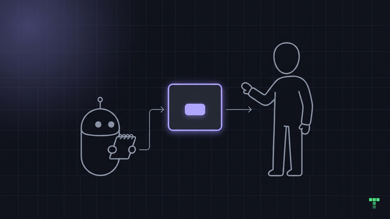
Every product runs on two models: how the system works, and how its customers believe it works. Don Norman named both in 1988, and he named the only bridge between them, which is the interface. When a fully restorable Archive button still makes people hesitate, the code is right and the model in their head is wrong. The cheapest fix is usually one word.
What are the design model and the user's model?
Norman's book was first published in 1988 as The Psychology of Everyday Things and is read today as The Design of Everyday Things. Its first chapter separates three things that a builder tends to treat as one:
- The design model is the designer's idea of how the thing works: for software, your schema, your state machine, your API.
- The user's model is the picture a customer builds in their head from using it.
- The system image is everything the product presents: its structure, its labels, its behaviour and its documentation.
The designer never talks to the user directly. Every bit of the design model reaches the customer through the system image, and if the image is unclear, the customer builds a different model and acts on that one. They are not wrong to; it is the only evidence they were given.
Norman counts the manual as part of the system image, and he is right to. But nobody opens the docs before clicking one menu item. For a single action in a web app, the system image is mostly the word on it and what happens after the click.
Why does a correct Archive button still make people hesitate?
Take the button most products ship sooner or later. Clicking Archive sets archived_at to the current time, and the list query filters on archived_at is null. Restoring clears the field. Nothing is lost, the tests pass, and the implementation is as correct as software gets.
The customer reads the word and brings their own meaning to it. To some people an archive is a shelf in the basement; to others it is where things go to stop existing. The second group pauses every time, files a support ticket asking whether they can get it back, or leaves the list uncleaned because cleaning feels permanent.
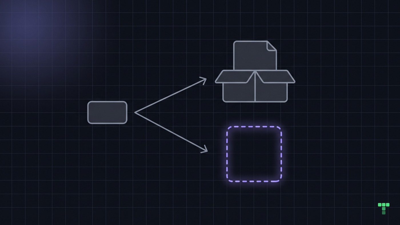
You cannot unit test a mental model. A test asserts the design model against itself, so a green suite says the system does what you meant. It cannot say what the person in front of the screen expects it to do.
We have paid for this lesson in our own catalog. Our design ledger records it as P-14: a ticker rail on the Marquee theme claimed a "pause on hover" for its moving text, and the review upheld it because the pause was there in the source. A keyboard user and a touch user never hover, so for them the pause did not exist. The rule it produced is that a mitigation is driven, not read, because reading the code tells you what the system does and only using it tells you what a person meets.
What happens when an agent builds the interface?
A coding agent writes the schema and the label in the same pass, and it names the control after the column. archived_at becomes Archive, is_active becomes a switch called Active, soft_deleted becomes Delete. Each choice is defensible from inside the code, which is the only place the agent has looked.
That is the series thesis in one example: code is cheap now, and understanding is the bottleneck. An agent will ship three correct screens in an afternoon. Not one of them has met a customer, and the agent's model of your product is your codebase, because your customers' words are not in its context.
So put them there. The file the agent reads before it builds (AGENTS.md, a skill, a glossary) can carry a vocabulary row: "customers say hide, the code says archive". We keep our own interaction rules as words an agent reads before it starts for the same reason. A rule that lives only in a reviewer's head arrives after the screen is built.
What is the cheapest way to close the gap?
The fix is rarely a redesign. In rough order of cost:
- One word. Rename the action for what the customer gets, such as "Hide", or for where the thing goes.
- One line of feedback. Say what happened and put the way back beside it, an Undo next to the word Archived.
- One place to find it. Give archived things a home that is still reachable after the line has gone.
Gmail's archive works this way: the thread leaves the inbox, a line at the bottom of the screen says it was archived, and Undo sits beside it. The word alone carries an ambiguous model. The line beside it shows the customer which model is the true one.
Our own interaction contract (/interaction-pass) says the same thing as a rule: prefer undo for safe reversible actions, and confirm only the irreversible ones, with the object named and the consequence stated. It also counts a toast that is the only confirmation of a material change as a hard failure. The pitch queue in our Appetite dashboard theme is where those rules meet one archive action:
| Part of the system image | What Appetite's pitch queue ships | The rule behind it |
|---|---|---|
| The word on the action | "Move to earlier cycles", under an archive-box icon | Name the destination, not the mechanism |
| The receipt | {title} moved to earlier cycles. with Undo | Prefer undo for safe reversible actions |
| How long the receipt stays | A message with an action never expires | The theme's toast rule in its AGENTS.md |
| The way back after the receipt | An "Include earlier cycles" filter with its own removable chip | A toast is never the sole proof |
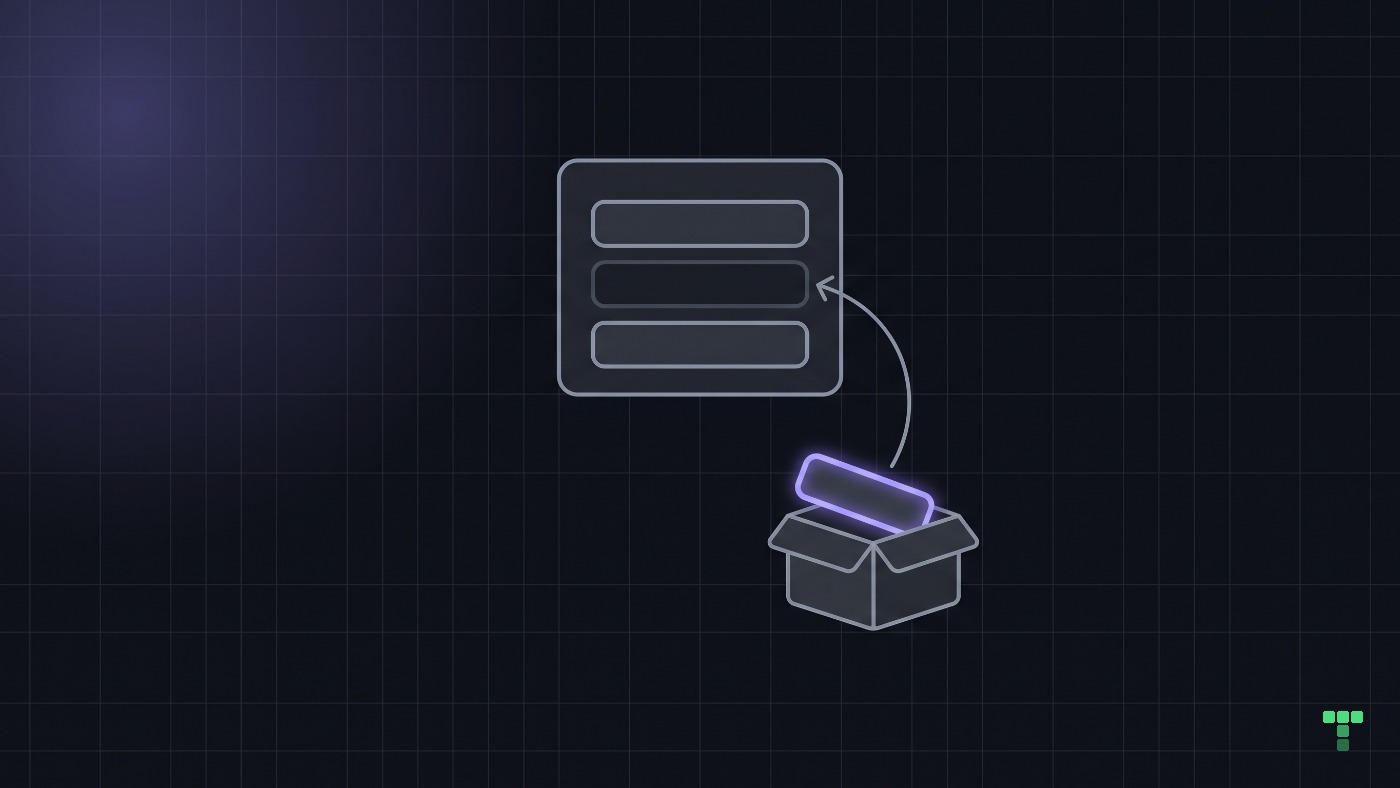
A word is the cheapest change, and it has two limits. When the action is irreversible, a softer word is a lie, and the honest fix is a confirmation that names the object and the consequence. And a receipt that disappears in five seconds is not a way back: it teaches the customer that the action was permanent after all, which is why the third line of the list above is the one that holds the other two up.
How do you find out what your customers expect?
Ask them before you touch the interface. Show three customers the screen, point at the action, and ask one question: "what do you expect will happen if you click this?" Then write down their words, not yours.
Three answers are not a study. Jakob Nielsen's 2000 essay on testing with five users argued that five find most of the usability problems in a design, so treat three as a first read that picks the cheapest change, not as a verdict. If two of the three reach for a word you never wrote, that word is the first label to try.
Check one action in your product
Pick the action that works perfectly and still makes people pause. Ask three customers what they expect it to do, and write their exact words beside the label. If the words and the label disagree, change one word or add one line of feedback before you redesign anything.
If you want to see the three changes working together, open the pitch queue in Appetite: an archive action named for where the pitch goes, a receipt with Undo that waits for you, and a filter that brings archived pitches back.