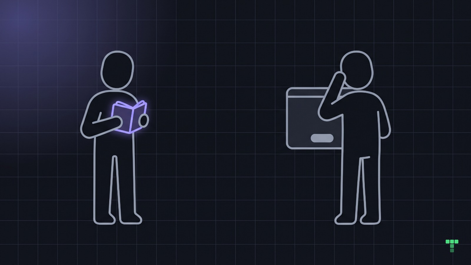
Users don't understand your app because your explanation doesn't ship with it. The team reads a feature through the schema, the spec and the thread where it was decided; the user gets the screen and nothing else. AI made the building cheap and left the understanding as slow as it was. Find the gap by watching someone use the app while you say nothing.
Why don't users understand an app the team finds obvious?
Because the team cannot un-know what it knows. Economists named this the curse of knowledge in 1989 (Camerer, Loewenstein and Weber), and a Stanford study the next year made it audible. Elizabeth Newton asked one group to tap out well-known songs and another to name them from the taps. The tappers predicted listeners would get about half; listeners named 3 of 120.
The tappers were not careless. They heard the melody in their heads while they tapped, and nobody else could. A product team is the tapper.
Take a Workspace feature. The team sees a workspaces table, a role on every member, and a workspaceId on every project, so sharing and permissions come out clean. The customer sees an empty dashboard with a button that says Create workspace, and asks one question: do I need one of these before I can start?
Same feature, two products. Only one of them is on the screen.
Why is AI making the gap wider?
Because everyone in an agent's loop meets the feature through the code. The agent wrote the schema, so it knows what a workspace is. You review its diff, so you know too. The pull request explains it to the next reviewer, and nobody in the chain arrives at the screen cold.
We keep the record of what that costs, because we paid for it. These come from our own incident ledger (ops/design/precedents.md) and the engineering rules written after one bad evening, 2026-08-21:
| What changed | What the team checked | What using it showed |
|---|---|---|
| Clerk's UI prefetch switched off to speed up the page | the page markup was identical before and after | nobody could sign in for four hours |
| A scrolling ticker on the Marquee theme, with pause on hover | the pause was read in the source and approved | keyboard and touch users had no way to stop 90 seconds of moving text |
| A design review run on the capture gate's screenshots | the review was recorded green | the eight screenshots were the same red error box |
None of those is a comprehension failure. They are the builder's version of one: proof that came from reading the work, never from using it. Each surfaced only when somebody used the real thing or looked at the real output.
Our engineering rules now say it outright: "drive the real interaction on the real deployment before saying it works." A screen a user cannot read is the same fault one layer up, and a type check cannot see it either.
Steve Krug put the bar in the title of Don't Make Me Think (2000): a page should be self-evident. Code is cheap to change now. Understanding is still bought one person and one session at a time.
How do you find what users don't understand?
Watch someone use it, and stay quiet. Jakob Nielsen calls thinking aloud perhaps the single most valuable usability method ("Thinking Aloud: The #1 Usability Tool", 2012), and the method is small: one person, one real task, and they say what they are thinking while they do it. His 2000 article "Why You Only Need to Test with 5 Users" argues five people find most of the problems a larger group would.
The hard part is the silence. You will want to point, to say "it's under settings", to explain what a workspace is. Every one of those urges is a bug report, and the screen is the component that failed.
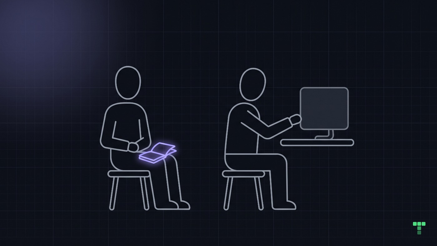
Log each one the way you log a crash: the screen, what they were trying to do, what they expected, and what you nearly said. The sentence you nearly said is the fix's first draft, because it is the explanation that never shipped.
Run one silent session this week
- Pick a task, not a tour. "Invite a colleague to your project" beats "have a look around".
- Pick someone outside the build. Anyone who has read the spec, the PR or the Slack thread is a tapper.
- Say nothing until they finish or give up. Write down every moment you wanted to step in.
- File each moment as a bug. Screen, intent, expectation, and the sentence you held back.
If an agent builds your screens, you can run a cold read before a person ever sees them. Our dashboard pass (/dashboard-product-pass) ends every build with three task walks, each started from nothing: find and open a record, repair and submit an invalid form, recover from an empty or failed state. Its rule is the one this post argues: a clean screenshot is not proof of a working task.
Does every hesitation need a redesign?
No. Some features take five seconds to learn and then never cost anything again, and that is a fair price. The question to ask of each logged moment is whether the confusion blocks the job or only the first click.
Nielsen's severity ratings ("Severity Ratings for Usability Problems", 1994) weigh three things, and the one teams skip is persistence: does the problem bother people once, or every time? Sort the log with it:
- Blocks the job. They could not finish without you, so the screen changes.
- Repeats every visit. A small cost paid daily is a large one, so it changes too.
- Costs the first click only. They paused once and never again, so leave it or add a hint.
The tempting fix for all three is more words on the screen, and it is usually wrong. Our own Clearing dashboard once shipped six panels with three-sentence footers, and every route read as an essay with a table in it. The rule that replaced them (/disclosure-pass) says a helper line is one clause, the reasoning sits one press away, and if the short line is misleading without the long one, the short line is wrong.
Code is cheap now. Understanding is the bottleneck, and it does not get faster by shipping more.
Your agent can carry the check too. Every theme in the catalog ships a check-quality workflow for the agent to run against the rendered page, and the one in the Clearing treasury dashboard asks that an empty table name the filter that emptied it.
We have not run moderated sessions with buyers of this marketplace, so this post has no session data of ours to show. The table is the builder-side shape of the gap, from our own incident records, not a usability study. Five silent sessions show you where people stall; they do not tell you how many of your users stall there.