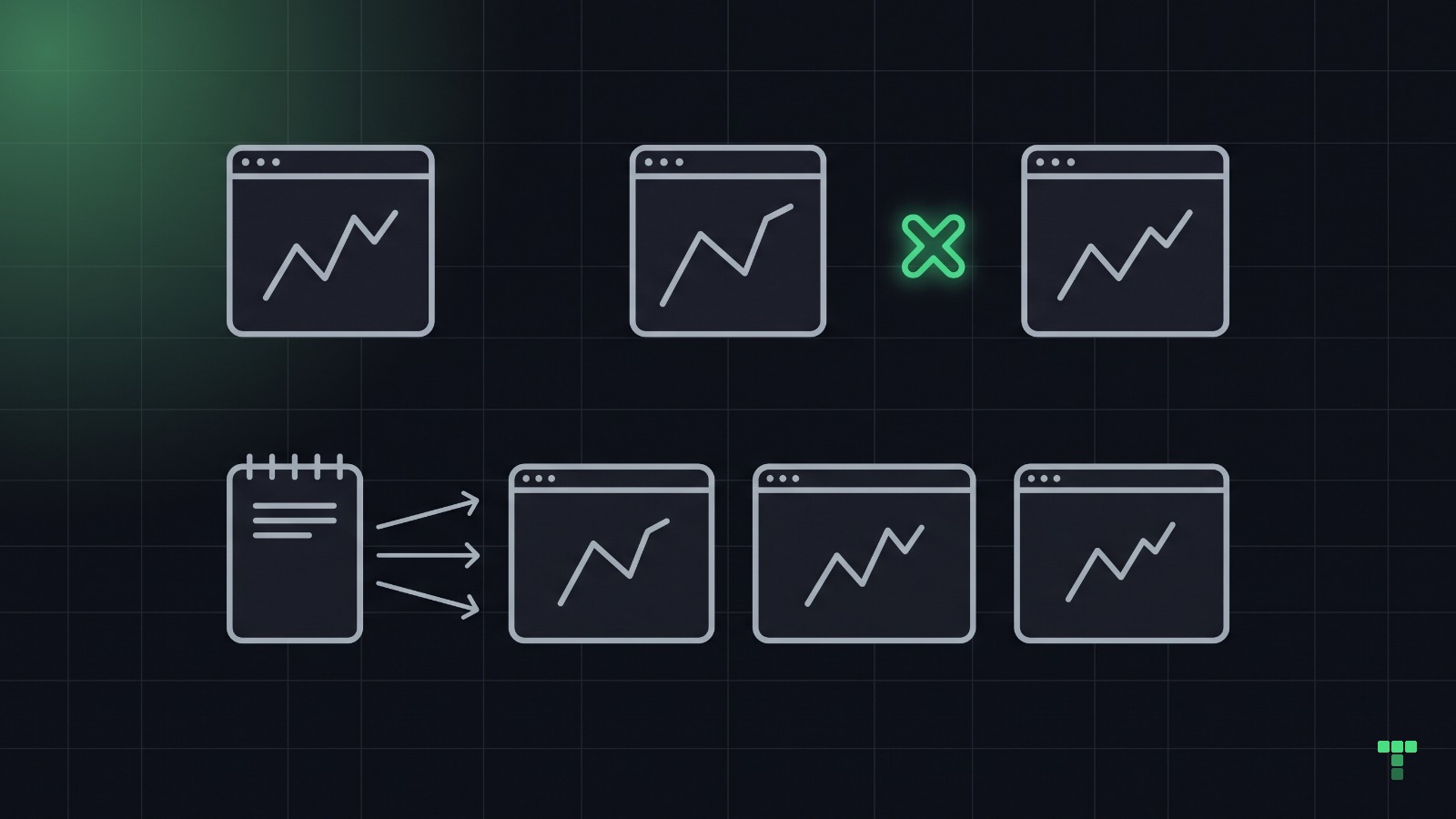
A dashboard is a set of numbers somebody will decide on, and its credibility is whether those numbers agree with each other. That agreement is a product-design problem before it is a visual one: decide the roles, the job each role comes for, the route that answers it, and the one source every figure reads from.
What is a dashboard before it is a screen?
Three things, in order.
- Roles and jobs. Who comes here and what they are here to decide: a sales lead to find revenue at risk, a product lead to place or break bets.
- One route per job. Every route answers one question for one role; two answers is two screens fighting, none is a screen nobody asked for.
- The spine. The figures that appear on more than one screen, on three axes (money, time, volume), listed with their arithmetic before a screen exists.
This is the pass we run before a dashboard theme gets a pixel. Appetite, our Shape Up dashboard, came out of it with six roles, five recurring jobs, six entities with lifecycles, eight routes, and 25 spine facts with the sums written next to them: 12 team-weeks as 6 + 2 + 2 + 2 bets, £126 a month as 9 seats × £14.
check your own project
Write that table for your own dashboard: one row per route, the role it serves, the question it answers. Then list every figure that appears on more than one screen. Each one typed by hand in more than one file is a contradiction waiting for the next edit.
Why do dashboards contradict themselves?
Because the figures are written by hand in more than one place, and nothing checks that the copies agree. The structural fix is one source, a fixture file or an API shape, that owns every number, name and date, with every screen a selector on it.
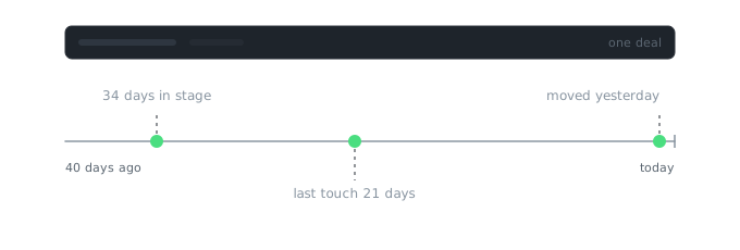
Our CRM theme is the clearest case we have. Its money spine worked that way from the start: the open pipeline, $1,284,500, appears in six places, five board columns, a stage chart, twelve table cells, a footer and a KPI, and a read-only critique recomputed all six and they agreed. Its dates were hand-authored in five files, and the same deal read three ages at once.
| Theme | Routes | Lead role → decision | Spine axes tabled | Contradictions found |
|---|---|---|---|---|
| Atrium (CRM) | 10 | sales lead → where is revenue at risk? | money | 5, all on time; 2 in one viewport |
| Cutroom (media ops) | 10 | media ops lead → what needs attention before release? | time, volume | 0, 7 facts verified |
| Switchyard (agent ops) | 20 | ops lead → where does automation need a person? | time, volume, money | 0 recorded |
| Appetite (Shape Up) | 8 | product lead → which bets to place or break | all three, derived | 0, 25 facts tabled with the arithmetic |
The fix was a product change, not a design one: one fixture file, every total a selector. The axis nobody tabled was the one that broke, which is the general lesson. A spine that guarantees money certifies time and volume by silence.
check your own project
Pick one number on your dashboard and find every place it appears. Then pick a date and do the same. If either is typed in more than one file, change it in one place and watch which screens disagree.
Where does this break?
A spine is a real state layer, a data.ts or a store, that a marketing page never needs. It is only worth building where numbers repeat.
Agreement is not truth. One of our themes shipped a proration formula that reconciled on every screen and was wrong on all of them. A spine proves your screens agree with your source; somebody still has to check the source.
A spine says nothing about whether the roles and jobs were the right ones. That is the part of the model no tool checks, and it is the part most dashboards get wrong first.
Appetite is the theme where the whole product model is readable before the screens: Appetite.
Four dashboards, one operator, one critique pass per theme. The contradiction count is what a read-only reviewer found on a given day, not an exhaustive audit.