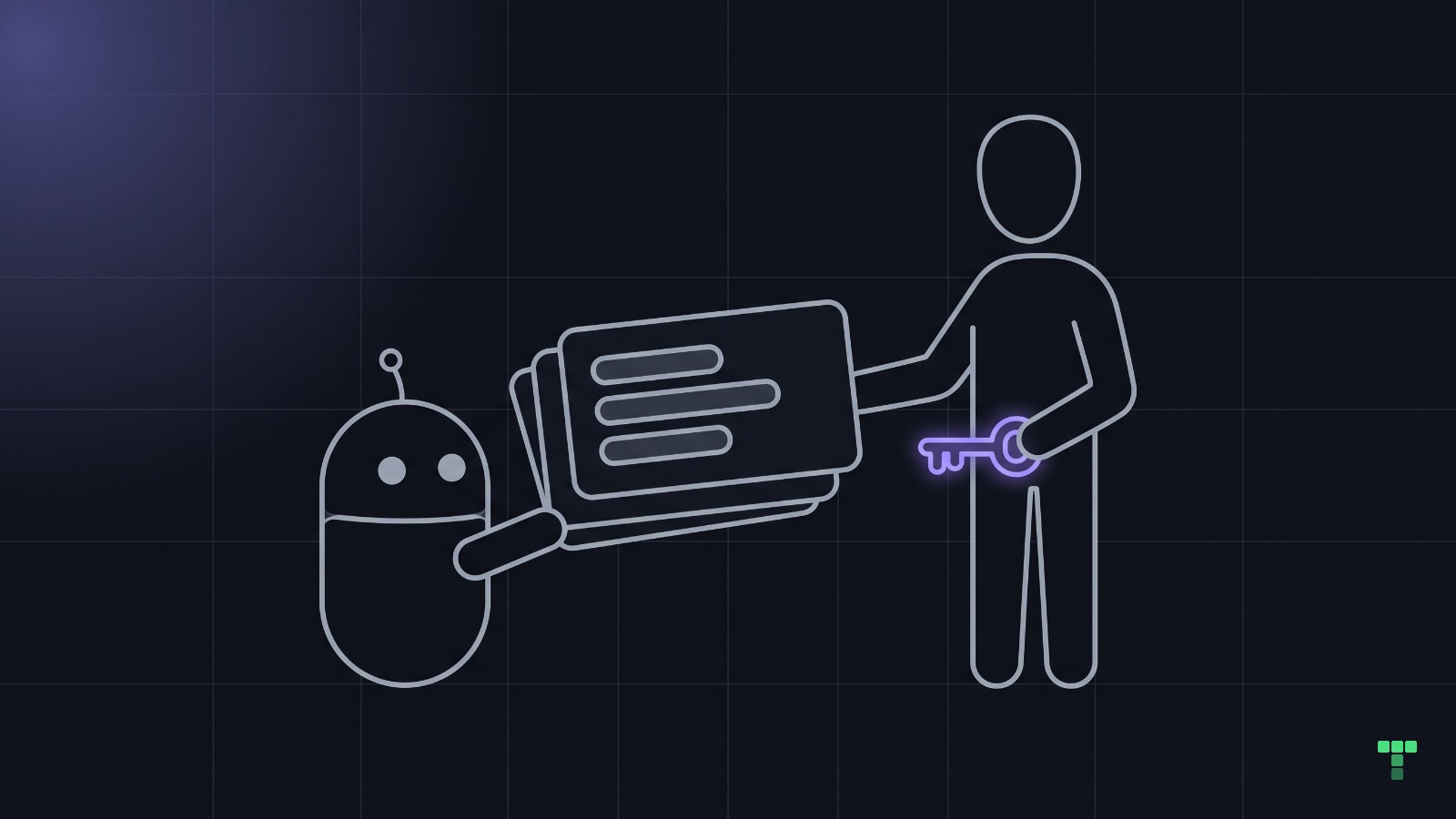
What do you do when you see enterprise design slop everywhere and keep hearing that nobody cares? ❤️🔥
As a Product Designer and AI Architect, I love experimenting with AI, including design.. but there are boundaries. A screen can be technically finished and still leave the customer wondering what they're looking at.
That's the part I keep coming back to. Can someone understand the page intent? Can they see what matters first, without reading every label and opening every tab?
Did we design it, or install shadcn?
In my experience, ask AI for a dashboard and it gives you filters, cards and a wall of content. Everything gets put on the page. Similar weight, similar boxes, paragraphs explaining things you haven't even decided to look at yet.
What it doesn't give you is the content balance. Useful tabs that separate views of the same thing. A clear main task, with the supporting detail one click away. You have to direct it towards those decisions.
I'm guessing AI just thinks AI will consume the screens :))
And yes, shadcn..
Install the components, keep the defaults, add a sidebar and suddenly everyone has shipped an enterprise product. The tab component is available. That doesn't mean the AI knows where it belongs, or which content should go inside it.
I like having good components available. But a component library cannot decide what your customer came here to do. Somebody still has to make that decision, then decide what can wait until the next click.
That's why our design skills spell these decisions out. Parallel views of one object belong in tabs, instead of being stacked down the page. A short explanation can open in a popover. A separate task needs its own page.
Content balance needs direction too. The main task gets the visual weight; supporting panels don't all compete with it. Icons should help me find my way, and helper text shouldn't turn every card into an essay.
That's progressive disclosure. Show me what I need now and let me ask for the detail. Don't make me negotiate with your entire database before I can do my job.
For me, Linear is the best reference for progressive disclosure and content balance. Their design principles include “Don't compete for attention you haven't earned.” They describe making navigation quieter so the work takes priority, and reducing unnecessary icons. That's the thinking I want AI to follow when I ask for a dashboard.
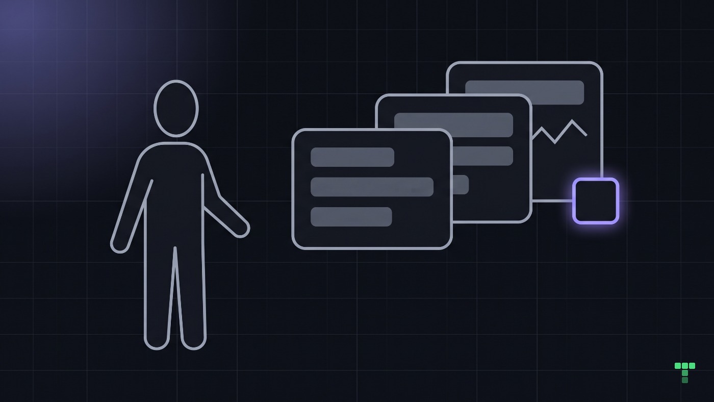
Why does design keep losing priority?
Tell someone leading a company that the product needs more design attention. The response I keep hearing is: we have other priorities.
Hiring sales. Hiring backend developers. Getting the next thing out.
Fair enough, a business has constraints. A broken backend needs fixing. An expert using the same tool all day can benefit from a dense screen. Hiding their everyday controls makes their work slower.
But when does the customer's confusion become a priority?
Branding barely gets a look either. We can spend time getting people into the product, then ask them to figure out a screen that looks like every other generated dashboard.
This is what I'd put in front of the team before another round of features. These are questions, not results from a usability study.
| What I'd ask | What I'd watch for |
|---|---|
| What is this page for? | The customer describes its purpose without a tour. |
| What would you do next? | They find the action without checking every card. |
| Where would you look for detail? | They can find it when the task calls for it. |
Will chat make this worse?
I can see us moving towards fewer full pages and more small widgets inside conversations. A table embedded in chat. A form when you need to change something.
Maybe that's better for some tasks. I don't know how far it goes.
What worries me is the same attitude following us there. A smaller UI still needs someone thinking about what the customer understands. Put a confusing table inside a chat and now you have a confusing table inside a chat.
What's your take? Do you struggle to understand the apps you use, or have we just got used to working around them?