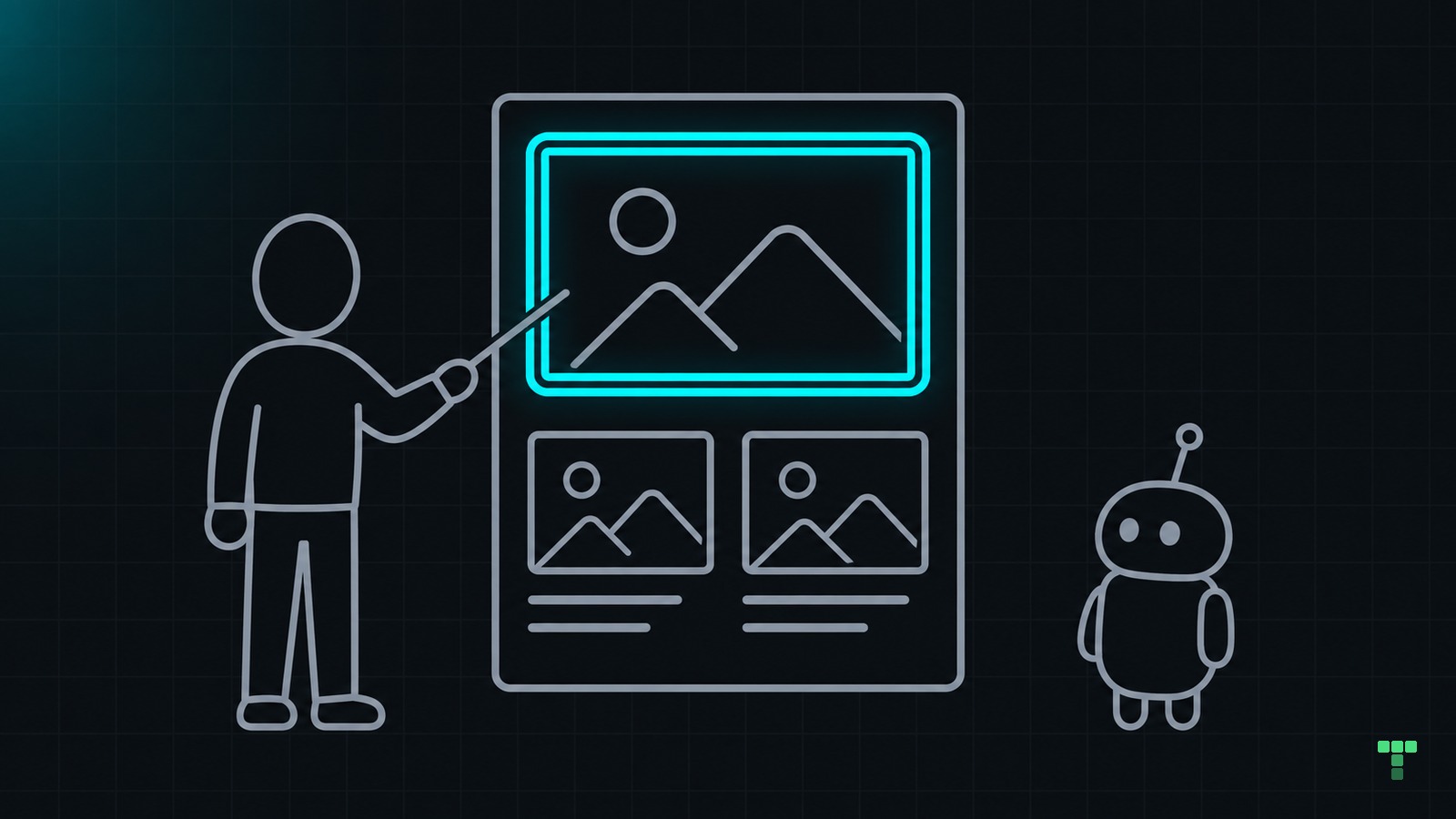
Make AI-generated UI look custom by choosing a direction, reviewing one screen and giving the model specific feedback.
You ask an LLM for a landing page. Nothing looks broken, but it could belong to any business.
“Make it less generic” leaves the next decision open too. The model might change the font when the problem is that your best work is buried below three paragraphs of introduction.
Treat the first version as something to discuss. You choose what the page needs to say; the model helps you explore and build it.
Where should you start?
Pick a visitor and one thing they need. For a photographer's portfolio, that might be seeing enough work to decide whether to enquire. Start there.
Give the model your content and existing components. If you share a reference, name what you like about it, such as the space between projects. Ask it to interpret that choice, not copy the site.
Here's an example prompt, not a transcript of a tested run:
Choose a direction
This is a portfolio for an architectural photographer. Visitors need to see the work before reading about the studio. Suggest two page structures using the same photographs and text and explain what each puts first but don't write code yet.
You might choose one project to fill the opening screen, with the introduction below it. Say why: the work should make the first impression. Ask for that section alone.
Name what must stay. Exploring the layout doesn't have to mean replacing your typeface or palette.
How do you give useful feedback?
Open the page. Describe what your eye reaches first and whether that matches the visitor's task. Point to something you can both locate.
| Vague request | A more useful direction |
|---|---|
| Make it feel more custom | Give the lead project more space; make the studio introduction secondary |
| Improve the typography | Keep the typeface; shorten the text measure and separate the caption from the heading |
| Add some animation | Make the project link respond on hover and keyboard focus; keep reduced-motion preferences respected |
These are example instructions, not rules for every website. A dense project index may suit an archive better than a full-screen photograph.
Change one decision at a time, keeping the content and viewport the same for comparison. Keep what works. If something got worse, name it before asking for another redesign.
You can disagree. “The layout is balanced” isn't an answer if visitors still can't find the projects. Judge the page, not the confidence of the reply.
What should the next edit keep?
Once a choice works, put it somewhere the next task can use. Keep shared colour, type and spacing decisions in your Tailwind token layer. Keep repeatable structure in components and record the reason beside the relevant design rule.
Here, project images lead and the studio introduction follows the work. The next page can reuse that direction without copying the layout.
Review the finished screen
Try the page at a narrow width and navigate it with a keyboard. Check that images load, text stays readable and interactive elements have visible focus. Ask the model which checks it ran and which still need you to verify them.
If you want an existing starting point, see how to work with a TailThemes theme.
This is a suggested workflow, not a benchmark or an accessibility certification. A consistent token file can still produce an unhelpful page. You still need to decide whether the result serves the person using it.