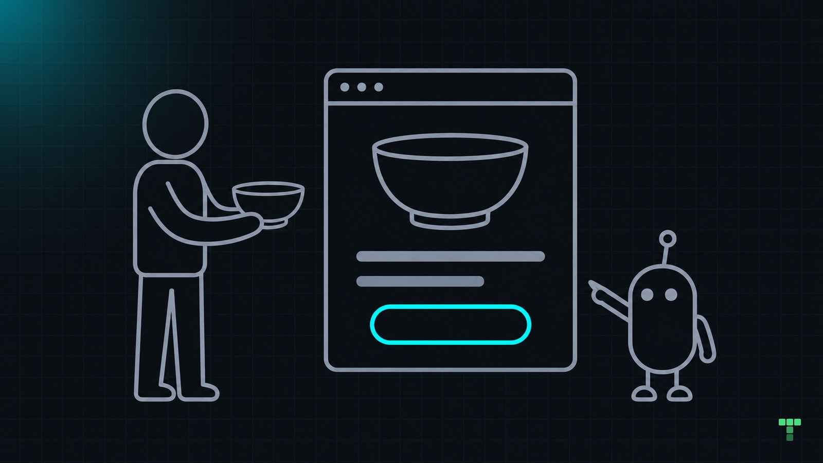
Vibe coding a landing page starts with deciding what visitors need, reviewing a rough page, then revising together.
Let's use an imaginary pottery workshop. This is an illustrative workflow, not a build we ran. The suggested feedback isn't a transcript.
What does the page need?
Your visitor is a beginner wondering whether they'll feel out of place. They need the date, location, cost and what happens during the session.
Write the brief in ordinary language:
“Make a page for a beginner pottery workshop that helps someone decide whether to book. Lead with what they'll make, then show the session details, what to expect and the booking link. Don't invent reviews, availability or prices. Ask me for anything missing.”
Supply those details before asking for polished copy. For this fictional example, a headline could be “Make your first pottery bowl.” The button says “Choose a session.” The paragraph underneath explains that beginners are welcome and materials are included, if both are true.
Separate confirmed details from questions for the organiser. If the firing date or collection arrangements are unknown, ask before writing a promise. A beginner may also need to know whether to bring an apron or return for another session.
Agree on an outline before code: the offer, practical details, a short walkthrough, common questions and booking. Remove sections without a purpose.
How do you design together?
Give the agent your Tailwind project and identify the page it may change. Ask it to reuse the existing design rules. Request a rough layout with the agreed copy, without animation.
Open it and describe what's wrong for the visitor. “More personality” leaves a lot to guess. “I see the studio name before I understand the workshop” points to a decision.
These are possible review notes, not measured improvements:
| What you notice | What you ask to change |
|---|---|
| The studio name dominates | Make the workshop offer the main heading |
| Details disappear below a large photo | Put date, location and cost beside the offer |
| Every section looks equally important | Give practical details more weight than the FAQ |
| Two buttons compete | Keep booking primary; make directions a text link |
Review one change before moving on. Ask the agent to leave the rest alone. Compare at the same viewport with unchanged copy.
Then choose an image you're permitted to use. Its job is to show the activity. Ask for a mobile crop that keeps the important detail visible.
When is it ready to share?
Read as a stranger. Check the booking destination. A frontend template doesn't provide booking or payment processing.
Test the whole booking handoff. If the button opens another service, check that the workshop name, date and price agree with the page. Explain that transition near the button so visitors know what opens next. If bookings are not open, offer a clearly labelled way to ask about future sessions.
Try your own page
Can you find the offer, practical details and next step without guessing? Follow every link. Use the keyboard, inspect visible focus and read the narrow layout. Ask someone else what they expect after pressing the main button.
Keep the diff and matching captures to explain your decisions and the agent's implementation.
This workflow doesn't prove the page will attract bookings. You still need honest content, interaction testing and feedback from people considering the offer.
If you need a starting point, see how TailThemes works with coding agents.