Dark mode and the three presets
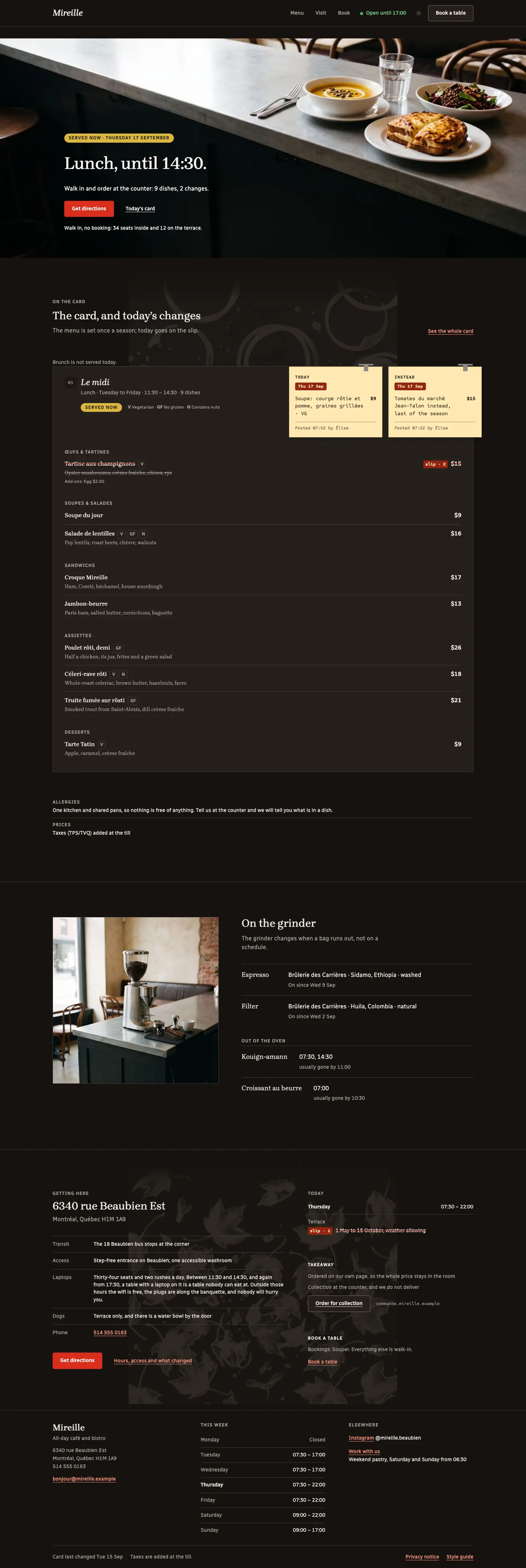
WordPress has no dark mode. Table and Type ships one, and it is a stylesheet rather than a setting.
How it decides
Three things, in this order:
- The visitor's own operating system. With nothing else set, a device in dark mode gets the
dark face and a device in light mode gets the light one. No script is needed for this: it is a
prefers-color-schememedia query, and it is correct on the very first paint. - The header's light/dark control. Pressing it writes the choice on the page and remembers it in that browser. It overrides the operating system for that visitor, on that device, until they change it again.
- The Dark style variation, which is a different thing entirely — see below.
The remembered choice is restored by a very small script before the page is painted, so switching
pages does not flash. The control itself is a block, table-and-type-core/color-scheme-toggle, and
it lives in the header part's utility slot. Remove the block and the site still follows the
operating system; it simply stops offering a choice.
Every colour has two values
The theme's palette carries 84 tokens, and each one has a light value and a dark value in the same file. The dark face is not a second palette — it is a remap of the same names. That is what makes a style variation able to carry both modes at once, and it is why changing a palette colour in Styles changes both faces together.
The four variations
Appearance › Editor › Styles › Browse styles.
| Variation | What it is |
|---|---|
| Base | Warm limestone, the default. Follows the operating system, and the toggle works inside it. |
| Dark | A site that is dark always, whatever the visitor's device says. Inside it the toggle becomes a no-op, which is the honest behaviour for a fixed choice. |
| Cresson | Watercress green with a blush slip — a morning-and-brunch café. Both modes, toggle working. |
| Faïence | Enamel cobalt with an apricot slip — a tiled bakery-café. Both modes, toggle working. |
A preset is a token swap and nothing else: no composition change, no second stylesheet, no pattern that behaves differently. Seventeen colour tokens move; everything else is the theme.
There are four entries rather than six because a "Cresson Dark" would be a separate variation that could not combine with anything, and a buyer who picked it would lose the OS-follow and the toggle — the one behaviour the control exists for. Each variation carries both its modes instead.
The limits
Three of them, stated rather than discovered.
1. The dark values are not editable in Global Styles. WordPress's Styles panel edits one palette.
The dark counterpart of each token lives in the theme's own theme.json, in a place the panel does
not show. Change a colour in Styles and the light face changes; the dark face keeps the value the
theme shipped. To change both, edit theme.json in a child theme.
2. A colour you add yourself does not switch. A custom colour you type into a block's colour picker is one value, and it is the same value in both modes. So is any duotone filter you apply to an image. If you add a colour of your own, check it in both faces before you publish — the theme cannot invent a dark counterpart for a value it has never seen.
3. The slip's material does not invert. --slip, --slip-ink, --slip-muted, --slip-stamp
and --slip-edge hold the same values in both modes in every variation. Paper is paper: a warm
yellow sheet clipped to a dark card still reads as a sheet of paper, and a dark-mode slip that
inverted would read as a hole in the page. Only the clip and the shadow follow the mode. This is a
design decision, not an oversight, and the release gates check it.
If dark mode flashes
See Troubleshooting.