sent here for Foundry
free tailwind agency portfolio template · React and HTML source
Foundryfree Tailwind agency portfolio template
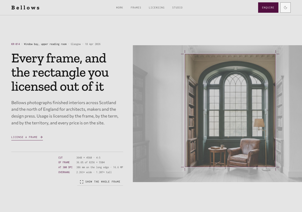
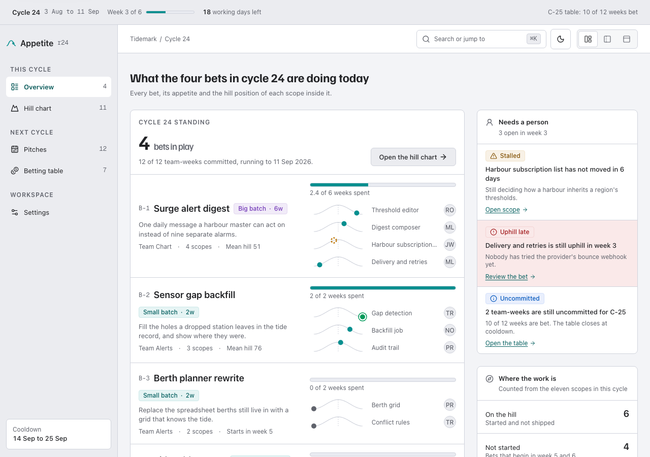
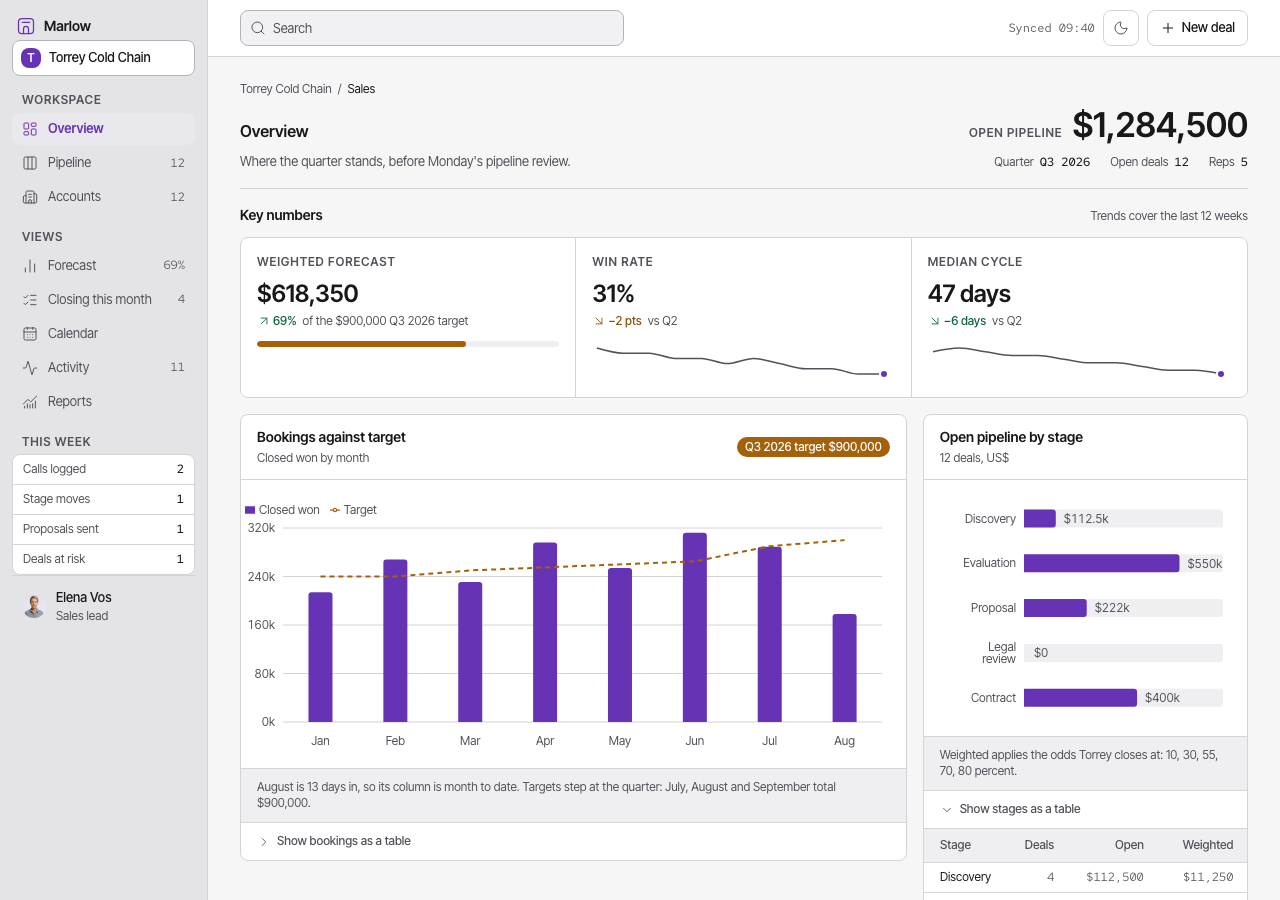
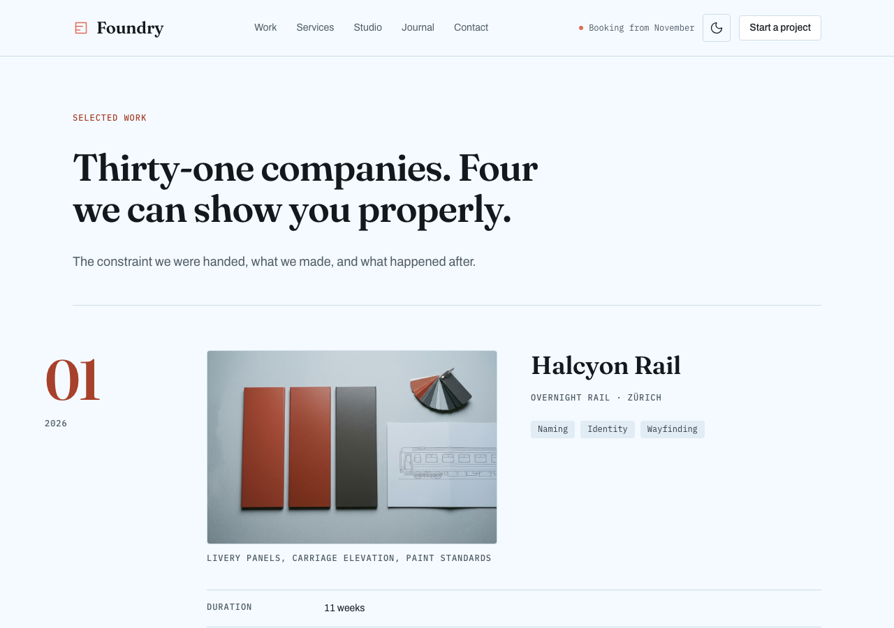
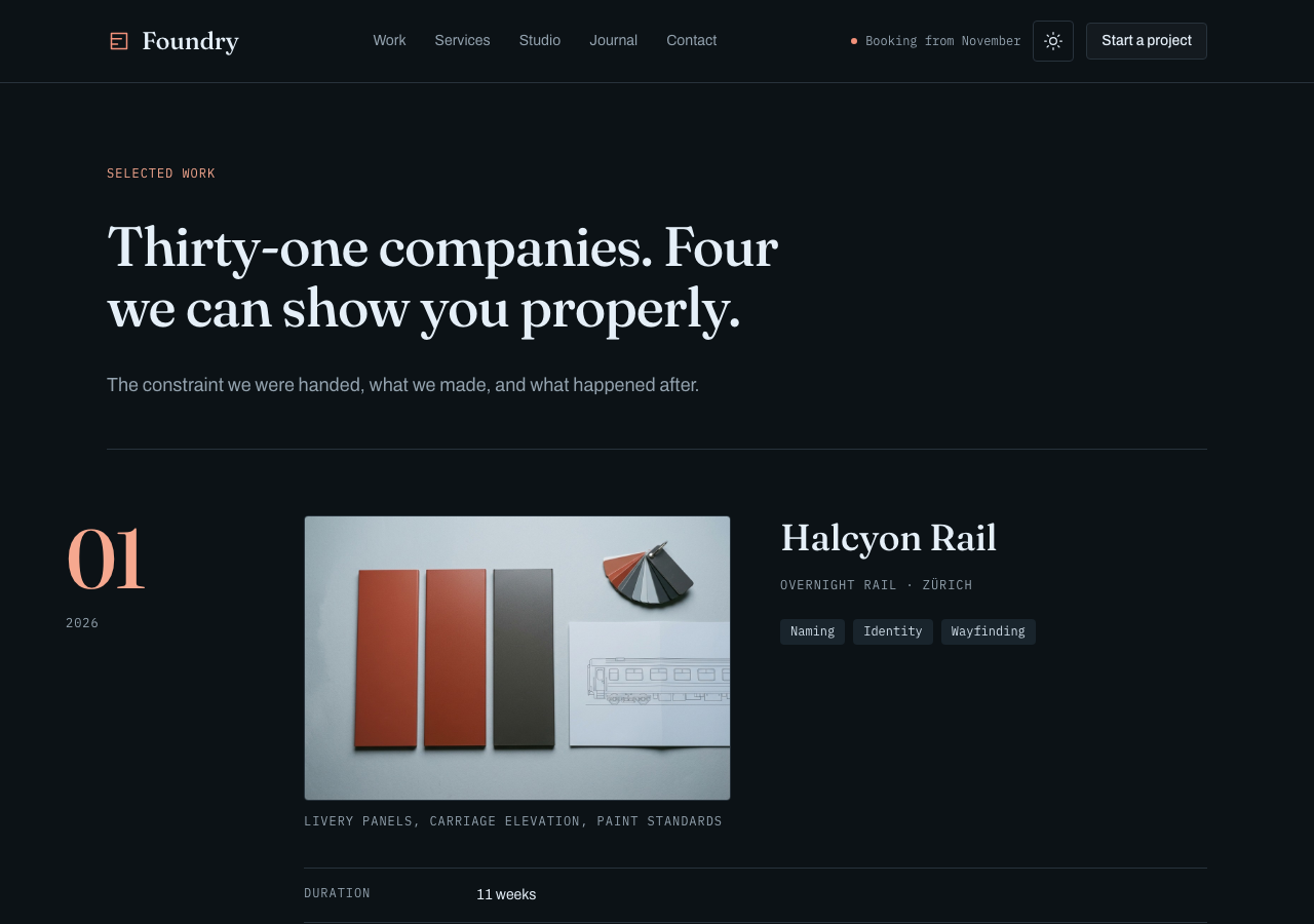
Foundry is a free Tailwind agency portfolio built like a piece of editorial production.
- 50 / 50
- light / dark tokens
- 2
- modes, both designed
- 1
- DOM, rendered twice
It includes a separately authored React edition and a framework-free HTML template edition, with ready static pages, Nunjucks source and vanilla JavaScript.
- unlimited projects, client work included
- 12 months of updates
- 14 days, no questions
AGENTS.md and 4 skills ship in the zip, so your own agent keeps changing it after you buy.
docs: install, use, customizepages, composed from 21 sections
Every page is a real render from the publish gate, in the mode on show. Open any of them in the live preview.
- Work/work
- site-header
- work-index
- client-band
- cta
- site-footer
 Home/
Home/- site-header
- hero
- client-band
- selected-work
- services-ledger
- +4
 Services/services
- site-header
- services-ledger
- capabilities
- process
- faq
- +2
 Studio/team
- site-header
- team-grid
- manifesto
- open-roles
- cta
- +1
 Contact/contact
- site-header
- contact-desk
- faq
- enquiry-form
- cta
- +1
 Journal/journal
- site-header
- journal-entry
- journal-notes
- cta
- site-footer
 Legal/legal
- site-header
- page-header
- legal-notice
- cta
- site-footer
 The parts/components
- site-header
- page-header
- hero
- client-band
- selected-work
- +16
Fraunces display type, Archivo text and IBM Plex Mono labels sit on cool steel paper with one restrained coral accent. A priced services ledger, four complete case studies, a validated enquiry form, a long-form journal and legal imprint cover eight routes including the living component guide. Twelve generated photographic plates show the work, bindery, railway arch and six fictional teammates in one coherent editorial shoot. Portraits and case evidence stay separate from names and captions, so no text crosses image pixels. Light and cold-ash dark modes share one semantic token system with computed WCAG AA pairs. The React source includes twenty-one independent sections and twelve shared primitives, two of them dialog and disclosure parts whose behaviour and structure are vendored and whose whole appearance is one editable recipe file, plus three self-hosted typefaces and four extension skills.
sections and primitives
You get the parts, not just the demo site. Every frame is a real capture from the theme's own styleguide page, and the source path under it is where the file lands in your project. 24 frames cover them, with 10 primitives sharing the ui/* frame.
tokens, both modes
Change one variable and every part follows. Each badge is one token split down the middle: its light value on the left, its dark value on the right, with the theme's own paired ink on both halves.
hover or tab a badge for its name and both values, enter copies
The ruled ledger row — a hairline-ruled list where each row is a mono index, a display-size name and a right-aligned figure, with one row tinted and bled to the band edge. It recurs on the home page, /services and /work.
every token
typefaces, self-hosted
Real woff2 files in src/fonts/, wired through next/font and licensed under OFL. Nothing is fetched from Google at build time, so the zip renders these letterforms offline. Scale ratio 1.5.
Foundry
Foundry is a free Tailwind agency portfolio built like a piece of editorial production. It includes a separately authored React edition and a framework-free HTML template edition, with ready static pages, Nunjucks source and vanilla JavaScript.
const { open, close } = useLedger("2026-03") // 0123456789
- display
- Fraunces
- text
- Archivo
- mono
- IBM Plex Mono
- d1Ag
- d2Ag
- d3Ag
- d4Ag
- leadAg
- bodyAg
- smallAg
- captionAg
every width is a real render from the publish gate
Four viewports, each one a render the gate produced and checked. Switch between them: the frame narrows exactly as a window does, because that is what it is.
every token and every part on one page
The styleguide route is not documentation about the theme. It is a page in the zip that renders the real components from the real tokens, so it stays true the day you change one.
files in the zip
Two independently authored editions: React for applications, plus ready HTML, CSS and vanilla JavaScript for static hosts.
- AGENTS.mdthe theme's own rules, written for an agent
- .claude/skills/4 skills, each one job
- add-page/SKILL.mdCompose a new page for the Foundry theme out of its existing sections, matching the shell, background rhythm and manifest entries of home/services/team
- add-section/SKILL.mdAdd a new self-contained section component to the Foundry theme following its existing file, token and rhythm patterns, then wire it into a page and the manifest
- check-quality/SKILL.mdRun Foundry's own quality gate locally
- rebrand/SKILL.mdRe-colour the Foundry theme to a buyer's brand by editing tokens in themes/foundry/src/theme.css only, keeping both light and dark complete and re-verifying WCAG AA
- src/
- theme.css50 tokens, light and dark
- fonts.tsthe faces, wired to the type tokens
- app/8 files
- components/21 files
- ui/13 files
- assets/13 images, 1 markdown file
- fonts/4 font files, 3 licenses
- app/8 routes, plus layout.tsx and globals.css
- theme.jsonthe manifest: tokens, components, pages
- html/the framework-free edition
- dist/8 compiled routes, deploy-ready — no build step
- src/the Nunjucks source the routes compile from
- scripts/build-html.ts · serve-html.ts — `bun run build:html` / `preview:html`
- README.mdquickstart
- 6 project filespackage.json · tsconfig.json · next.config.ts · postcss.config.mjs · env.d.ts · .gitignore
skills your agent can run
Your agent reads AGENTS.md before it edits, then runs the skill that fits the change. The skills are the theme's own, and the publish gate makes an agent complete every one of them in a scratch copy before the theme goes live.
33 components, 8 pages and 50 tokens, as a Next.js project.
AGENTS.md carries the design spec. Each skill is one job written against it.
Claude Code, Codex, or any agent that reads AGENTS.md. It runs on your machine, on your own account.
Built from the theme's own sections, on the same tokens and the same rhythm.
The source is yours to run, edit and deploy.
The spec ships inside the folder, so the page your agent adds next month is built by the same rules as the ten it came with. Nothing calls back here.
What the free license coversWhat do I actually get?
Does it include the pages I'd otherwise have to build?
Will it work with my stack?
How long before it stops looking like a template?
Can I use it for client work?
activity
- v2.10.2: Opens on the work index, and the manifesto's four-figure strip is gone.
- v2.10.1: The header's Start a project is now a bordered button, so the hero holds the only fill, and the hero's 2–12 week range comes from the services ledger.
- v2.10.0: Dialog and accordion built from the library, in both editions
- v2.9.2: The motion audit adopts nothing new and fixes the press and the focus ring
- v2.9.1: The add-page skill gained the full HTML-edition route recipe, and the rebrand skill no longer promises a two-file diff
- v2.9: An accessible field boundary — controls no longer borrow the ruled hairline
- v2.8: Disabled and read-only fields, a busy button, and a real submitting phase on the enquiry form
- v2.7: Separate Nunjucks source and framework-free HTML output
- v2.6: Six generated editorial team portraits replace the monogram placeholders
- v2.5: Canonical project provenance with duration, named team roles and one constraint per anchored case
- v2.4 — six photographic plates: case covers, the bindery, the arch
- v2.3 — the ground goes steel: whole neutral ramp cooled, both modes
- v2.2 — enquiry form, drawn arch map, /journal, /legal, mode toggle
- v2.1 — /contact route: three desks, the arch, working FAQ
- v2.0 — Fraunces/Archivo/Plex Mono, 1.500 scale, A6 hero
- v1.4 — laid-paper luminance layer on page openers
- v1.3 — /components living styleguide
- v1.2 — /work case ledger + link integrity
- v1.1 — lucide icon system + polish pass
- v1.0.0 — open-sourced: tokens + components
- per-post journal routes, once there are eight notesplanned
for agents
This listing is also a markdown document and a JSON endpoint. The theme's own agent kit is on the kit and agents plates above.