sent here for Signal
developer tool landing page template · React and HTML source
Signaldeveloper tool landing page template
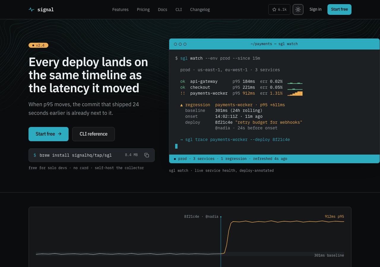
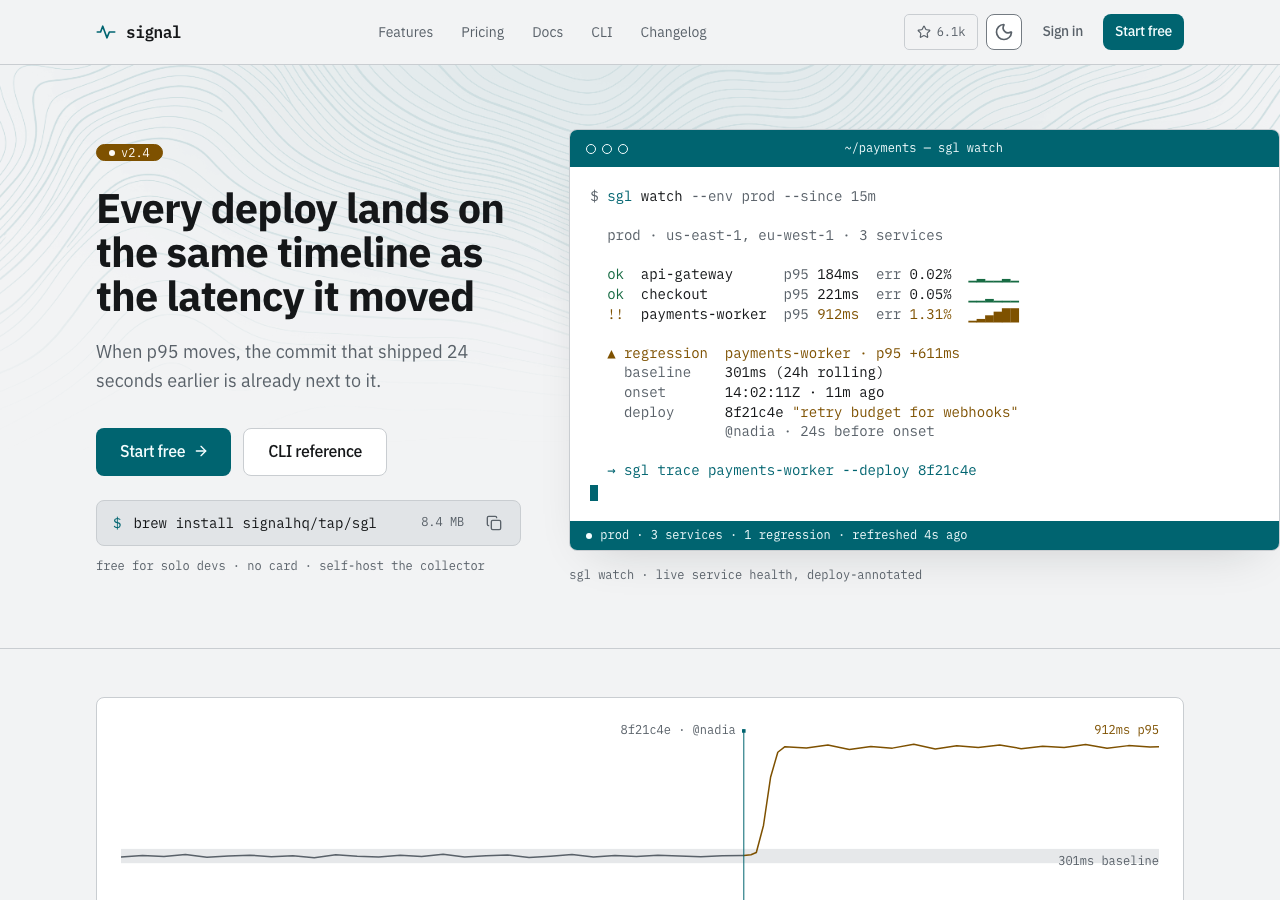
A dark-first developer tool landing template for CLIs, built around an annotated regression trace.
- 73 / 73
- light / dark tokens
- 2
- modes, both designed
- 1
- DOM, rendered twice
Eight routes include a frontend-only incident detail with explicit UTC windows, sample counts, deploy evidence, failure groups, and a resolution receipt.
- unlimited projects, client work included
- 12 months of updates
- 14 days, no questions
AGENTS.md and 4 skills ship in the zip, so your own agent keeps changing it after you buy.
docs: install, use, customizepages, composed from 19 sections
Every page is a real render from the publish gate, in the mode on show. Open any of them in the live preview.
- Signal — deploy-aware observability/
- site-header
- terminal-hero
- incident-band
- integrations
- feature-grid
- +3
 Pricing — a working estimator, then the price model/pricing
- site-header
- cost-estimator
- pricing-plans
- faq
- cta
- +1
 Changelog — every release, dated and attributed/changelog
- site-header
- changelog-section
- cta
- site-footer
 Docs — quickstart/docs
- site-header
- ui/page-hero
- docs-shell
- site-footer
 CLI reference — every sgl command and flag/cli
- site-header
- ui/terminal-window
- docs-shell
- site-footer
 Contact — engineering addresses, response times, legal/contact
- site-header
- contact-card
- cta
- site-footer
 Incident detail — evidence from deploy to resolution/incident
- site-header
- incident-header
- trace-comparison
- deploy-diff
- evidence-timeline
- +3
 The parts — tokens, sections, primitives/components
- site-header
- terminal-hero
- incident-band
- integrations
- feature-grid
- +23
Interactions include a light and dark toggle, copy controls, tag filtering, and cost arithmetic. IBM Plex Sans and Mono are self-hosted. The neutral structural palette, independent status families, application states, and all 73 tokens per mode are documented with computed flat-token contrast. Every rendered href resolves to a shipped page or anchor. A framework-free HTML template edition compiles the same eight routes to standalone documents, with the local IBM Plex faces and vanilla JavaScript in place of the React runtime.
sections and primitives
You get the parts, not just the demo site. Every frame is a real capture from the theme's own styleguide page, and the source path under it is where the file lands in your project. 23 frames cover them, with 16 primitives sharing the ui/* frame.
tokens, both modes
Change one variable and every part follows. Each badge is one token split down the middle: its light value on the left, its dark value on the right, with the theme's own paired ink on both halves.
hover or tab a badge for its name and both values, enter copies
The annotated regression trace: a latency series whose vertical deploy marker carries the commit that moved the number, so the cause sits inside the drawing instead of in prose beside it — 8f21c4e by @nadia above the bend, 912ms p95 on the plateau. It has four route-level tellings: / opens the story, /changelog records the release, /cli prints the trace, /incident closes the investigation; /pricing and /contact carry none. Every figure resolves through SIGNAL_INCIDENT (src/fixtures/incident.ts): the drawn series peaks and ends on incident.value, and the caption's 24s is onsetDelaySeconds computed from the deploy and onset timestamps, so the marker cannot drift from the number it explains. Not portable: an annotated trace needs a deploy and a metric on one timeline, which a landing page or a pricing table does not have.
every token
typefaces, self-hosted
Real woff2 files in src/fonts/, wired through next/font and licensed under OFL. Nothing is fetched from Google at build time, so the zip renders these letterforms offline. Scale ratio 1.2.
Signal
A dark-first developer tool landing template for CLIs, built around an annotated regression trace. Eight routes include a frontend-only incident detail with explicit UTC windows, sample counts, deploy evidence, failure groups, and a resolution receipt.
const { open, close } = useLedger("2026-03") // 0123456789
- text
- IBM Plex Sans
- mono
- IBM Plex Mono
No separate display face: the headings are set in the text face.
- captionAg
- smallAg
- bodyAg
- leadAg
- d1Ag
- d2Ag
- d3Ag
- d4Ag
every width is a real render from the publish gate
Four viewports, each one a render the gate produced and checked. Switch between them: the frame narrows exactly as a window does, because that is what it is.
every token and every part on one page
The styleguide route is not documentation about the theme. It is a page in the zip that renders the real components from the real tokens, so it stays true the day you change one.
files in the zip
Two independently authored editions: React for applications, plus ready HTML, CSS and vanilla JavaScript for static hosts.
- AGENTS.mdthe theme's own rules, written for an agent
- .claude/skills/4 skills, each one job
- add-page/SKILL.mdCompose a new Signal page from existing sections
- add-section/SKILL.mdAdd a new section to Signal that matches its existing patterns
- check-quality/SKILL.mdRun Signal's own gate locally
- rebrand/SKILL.mdApply a buyer's brand to Signal
- src/
- theme.css73 tokens, light and dark
- fonts.tsthe faces, wired to the type tokens
- app/8 files
- components/19 files
- ui/21 files
- assets/1 markdown file, 1 image
- fonts/4 font files, 2 licenses
- app/8 routes, plus layout.tsx and globals.css
- theme.jsonthe manifest: tokens, components, pages
- html/the framework-free edition
- dist/8 compiled routes, deploy-ready — no build step
- src/the Nunjucks source the routes compile from
- scripts/build-html.ts · serve-html.ts — `bun run build:html` / `preview:html`
- README.mdquickstart
- 6 project filespackage.json · tsconfig.json · next.config.ts · postcss.config.mjs · env.d.ts · .gitignore
Your key goes in TAILTHEMES_LICENSE_KEY, and the registry entry goes in components.json. The snippet is on the docs page.
skills your agent can run
Your agent reads AGENTS.md before it edits, then runs the skill that fits the change. The skills are the theme's own, and the publish gate makes an agent complete every one of them in a scratch copy before the theme goes live.
38 components, 8 pages and 73 tokens, as a Next.js project.
AGENTS.md carries the design spec. Each skill is one job written against it.
Claude Code, Codex, or any agent that reads AGENTS.md. It runs on your machine, on your own account.
Built from the theme's own sections, on the same tokens and the same rhythm.
The source is yours to run, edit and deploy.
The spec ships inside the folder, so the page your agent adds next month is built by the same rules as the ten it came with. Nothing calls back here.
What the standard license coversWhat do I actually get?
Does it include the pages I'd otherwise have to build?
Will it work with my stack?
How long before it stops looking like a template?
Can I use it for client work?
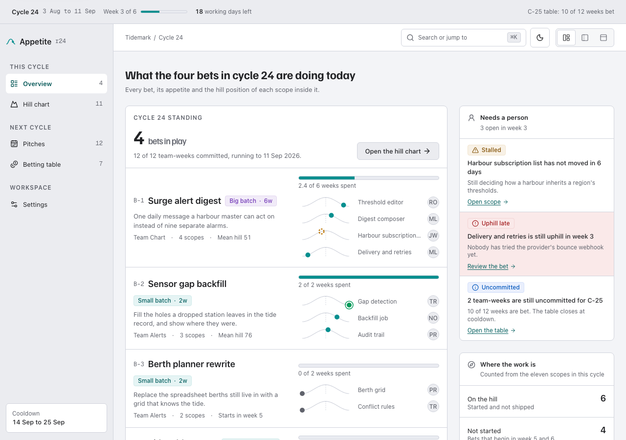
A SaaS is two builds, not one.
Signal is the site that sells the product. Appetite is the thing people log into once they have paid — same Tailwind version, same token architecture, so the two halves can be made to look like one company.
activity
- v2.8.4: The annotated deploy trace sits in the first screen, card grids drop decorative icons, pricing and changelog openings get a ruled band, and CLI help reads in full on a phone.
- v2.8.3: The design-system page's opening line has its missing space back, and form fields keep one word space before the optional marker.
- v2.8.2: The HTML edition's component guide no longer lists a copy control it does not include.
- v2.8.0: The field and the copy control come from the shared library, in both editions
- v2.7.0: The disclosure part in both editions, the FAQ the floor asked for, and five extractions in the mechanical register
- v2.6.3: The disclosure, the mobile menu, the copy swap and the arrows all get their recipes
- v2.6.2: The copy button now says blocked instead of failing silently, with a live announcement that survives repeat denials; the mode toggle and copy control gained real disabled states
- v2.6.1: The doc set gained its twelfth check and the HTML-edition story it never told
- v2.6: Button disabled and busy states, plus a full field family with invalid, read-only and submitting
- v2.5: Separate Nunjucks source and framework-free HTML output for every route
- v2.4 — incident evidence detail, canonical fixtures, explicit uncertainty and neutral-first status roles
- v2.3 — the incident band: the hero's regression narrative drawn as a p95 figure
- v2.2 — /pricing with a real cost estimator; /contact; mode toggle
- v2.1 — CLI reference page; every link goes where its label says
- v2.0 — Plex type layer, steel/amber palette, designed light mode
- v1.1 — lucide icon system + polish pass
- v1.0.0 — terminal hero with real code samples
- connect incident fixtures to a buyer telemetry backendplanned
- feature grid a/b variantplanned
for agents
This listing is also a markdown document and a JSON endpoint. The theme's own agent kit is on the kit and agents plates above.