sent here for Cutroom
next.js media dashboard template · React and HTML source
CutroomNext.js media dashboard template
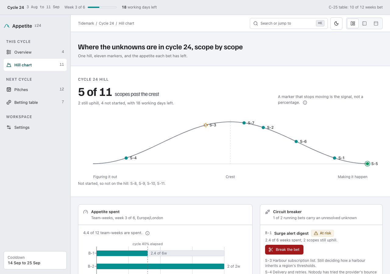
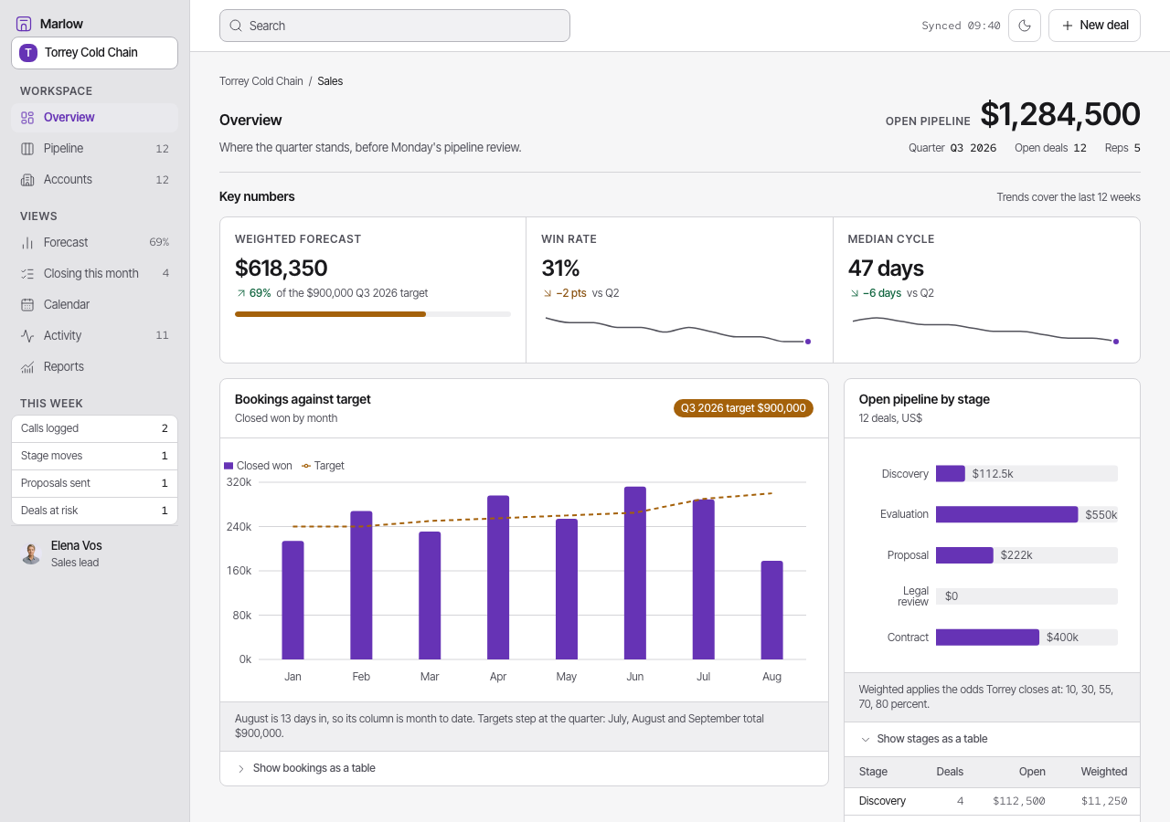
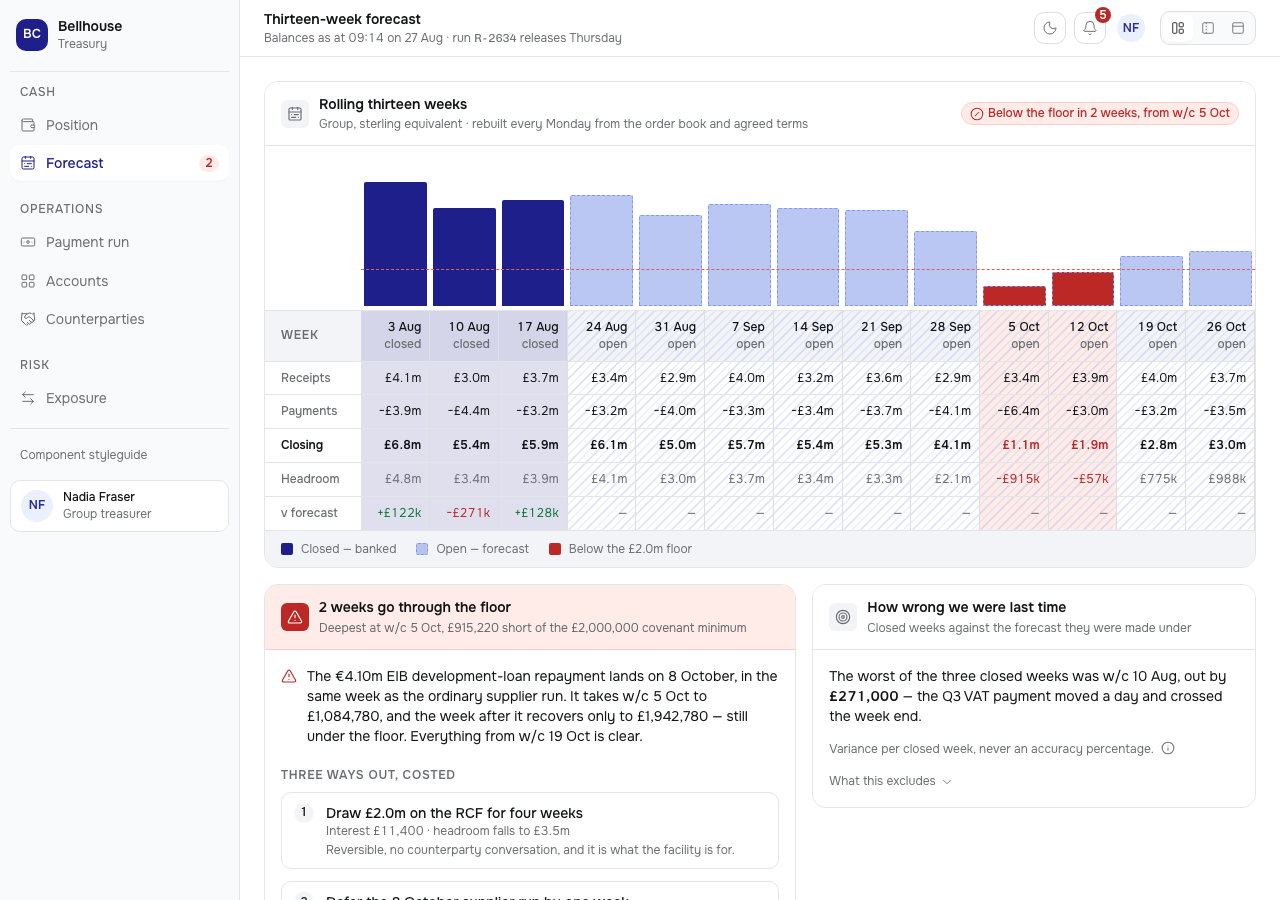
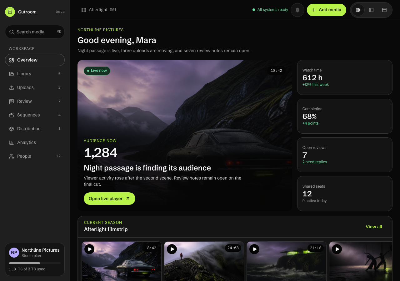
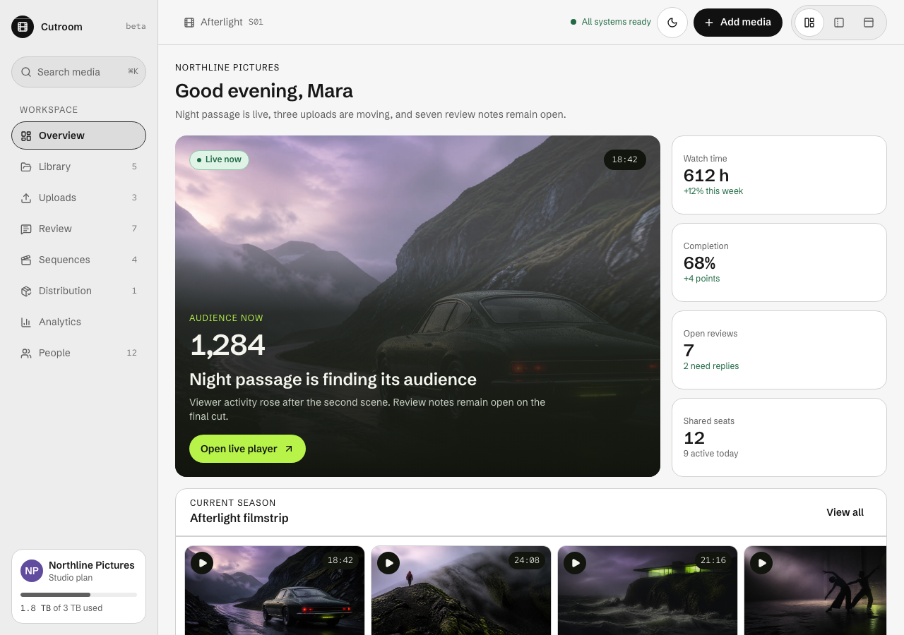
A media management dashboard template for Next.js teams that need footage, reviews, edits, release checks, and audience data in one image-led workspace.
- 89 / 89
- light / dark tokens
- 2
- modes, both designed
- 1
- DOM, rendered twice
- unlimited projects, client work included
- 12 months of updates
- 14 days, no questions
AGENTS.md and 4 skills ship in the zip, so your own agent keeps changing it after you buy.
docs: install, use, customizepages, composed from 13 sections
Every page is a real render from the publish gate, in the mode on show. Open any of them in the live preview.
- Overview/
- app-shell
- overview
- filmstrip
 Media library/library
- app-shell
- media-library
 Uploads/uploads
- app-shell
- upload-center
 Shared player/player
- app-shell
- shared-player
 Sequence builder/editor
- app-shell
- sequence-builder
 Distribution/distribution
- app-shell
- distribution-workspace
 Watch analytics/analytics
- app-shell
- watch-analytics
 People and plan/people
- app-shell
- people-settings
 Afterlight/title
- title-landing
 Components/components
- app-shell
- tokens
- ui
- ui/dialog
- ui/command-palette
- +19
Cutroom ships ten routes for an operations overview, searchable library, upload queue, shared player, timecoded comments, reel sequence builder, neutral distribution destinations, rendition requirements, a deterministic local delivery queue, watch analytics, studio accounts, a cinematic title page, and a living component guide. Its reusable dashboard shell switches between sidebar, icon rail, and top bar layouts, and a shared overlay layer gives the modal dialog, command palette, dropdown menu, popover, tooltip, toast, tabs, date picker, sortable data table, navigation drawer, and loading skeletons one keyboard contract: Escape closes, focus is trapped and returned, and only modal layers lock scroll. Controls with no service behind them are drawn as unavailable actions that say so, never as buttons that do nothing. The Northline Pictures fixture follows five Afterlight films from source upload through the Oct 18 release. The continuous filmstrip turns one ordered row of frames into the browse rail, review timeline, sequence canvas, and version reel. Storage, transcoding, streaming, external delivery, auth, billing, analytics ingestion, and persistence remain buyer integration points. Five original cinematic stills, two self-hosted OFL variable fonts, Lucide icons, Recharts analytics, complete light and dark tokens, computed WCAG AA pairs, visible focus, and reduced motion ship in the runnable project. A framework-free HTML template edition compiles all ten routes to standalone documents with local fonts and vanilla JavaScript, so the workspace runs on a static host without a build step.
sections and primitives
You get the parts, not just the demo site. Every frame is a real capture from the theme's own styleguide page, and the source path under it is where the file lands in your project. 42 frames cover them, with 8 primitives sharing the ui/* frame.
tokens, both modes
Change one variable and every part follows. Each badge is one token split down the middle: its light value on the left, its dark value on the right, with the theme's own paired ink on both halves.
hover or tab a badge for its name and both values, enter copies
The continuous filmstrip: one ordered row of frames becomes the library browse rail, review timeline, and sequence builder
every token
typefaces, self-hosted
Real woff2 files in src/fonts/, wired through next/font and licensed under OFL. Nothing is fetched from Google at build time, so the zip renders these letterforms offline. Scale ratio 1.125.
Cutroom
A media management dashboard template for Next.js teams that need footage, reviews, edits, release checks, and audience data in one image-led workspace.
const { open, close } = useLedger("2026-03") // 0123456789
- display
- Red Hat Mono
- text
- Schibsted Grotesk
- mono
- Red Hat Mono
- captionAg
- smallAg
- bodyAg
- leadAg
- d1Ag
- d2Ag
- d3Ag
- d4Ag
- heroAg
every width is a real render from the publish gate
Four viewports, each one a render the gate produced and checked. Switch between them: the frame narrows exactly as a window does, because that is what it is.
every token and every part on one page
The styleguide route is not documentation about the theme. It is a page in the zip that renders the real components from the real tokens, so it stays true the day you change one.
files in the zip
Two independently authored editions: React for applications, plus ready HTML, CSS and vanilla JavaScript for static hosts.
- AGENTS.mdthe theme's own rules, written for an agent
- .claude/skills/4 skills, each one job
- add-page/SKILL.mdCompose a Cutroom route from existing media surfaces without breaking navigation, filmstrip, heading, fixture, or frontend-honesty contracts.
- add-section/SKILL.mdAdd a self-contained Cutroom media surface with semantic tokens, complete states, manifest wiring, and component-guide coverage.
- check-quality/SKILL.mdVerify Cutroom's tokens, imagery, media fixtures, interactions, accessibility, captures, types, build, registry, and buyer package.
- rebrand/SKILL.mdRebrand Cutroom through its dark cinema tokens while preserving contrast, status semantics, and the continuous filmstrip.
- src/
- theme.css89 tokens, light and dark
- fonts.tsthe faces, wired to the type tokens
- app/10 files
- components/14 files
- ui/29 files
- assets/5 images, 1 markdown file
- fonts/2 licenses, 2 font files
- app/10 routes, plus layout.tsx and globals.css
- theme.jsonthe manifest: tokens, components, pages
- html/the framework-free edition
- dist/10 compiled routes, deploy-ready — no build step
- src/the Nunjucks source the routes compile from
- scripts/build-html.ts · serve-html.ts — `bun run build:html` / `preview:html`
- README.mdquickstart
- 6 project filespackage.json · tsconfig.json · next.config.ts · postcss.config.mjs · env.d.ts · .gitignore
Your key goes in TAILTHEMES_LICENSE_KEY, and the registry entry goes in components.json. The snippet is on the docs page.
skills your agent can run
Your agent reads AGENTS.md before it edits, then runs the skill that fits the change. The skills are the theme's own, and the publish gate makes an agent complete every one of them in a scratch copy before the theme goes live.
36 components, 10 pages and 89 tokens, as a Next.js project.
AGENTS.md carries the design spec. Each skill is one job written against it.
Claude Code, Codex, or any agent that reads AGENTS.md. It runs on your machine, on your own account.
Built from the theme's own sections, on the same tokens and the same rhythm.
The source is yours to run, edit and deploy.
The spec ships inside the folder, so the page your agent adds next month is built by the same rules as the ten it came with. Nothing calls back here.
What the standard license coversWhat do I actually get?
Does it include the pages I'd otherwise have to build?
Will it work with my stack?
How long before it stops looking like a template?
Can I use it for client work?
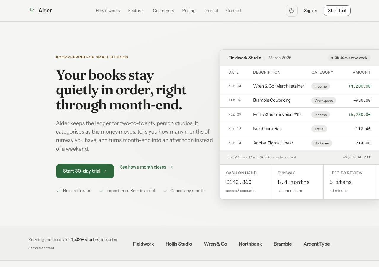
The dashboard needs a front door.
Cutroom is what your customers use. Grove is the page that gets them there — same Tailwind version, same token architecture, so the marketing site and the product do not look like two different companies.
activity
- v1.10.7: The listing now opens on the dark overview, where the chartreuse and the filmstrip show.
- v1.10.6: The library opens on the filmstrip rail, icons share one stroke, fact rows drop decorative discs, the dark upload well rests neutral, and the command palette shows keyboard focus.
- v1.10.5: Hero buttons read in light mode, the audience figure loses the gap around its comma, the analytics chart draws to the end, and Video URL starts clean.
- v1.10.4: Light-mode selected rows no longer swallow the focus ring: it reads 13.77:1 on a selected chip where it measured 1.43:1, under the 3:1 WCAG floor. Dark mode is unchanged.
- v1.10.3: Five screens read as one media lifecycle: asset identity carried into review, one transport clock, validated ingest, confirmed access changes
- v1.9.0: The HTML edition's dialog and menu move onto the library twins; the exit hold now collapses under reduced motion instead of holding an inert layer
- v1.8.0: Every wave-1 part on the library — dialog, confirm dialog, command palette, toast and date picker join, and the last hand-written engine is deleted
- v1.7.0: The first theme on the shared library: popover, tooltip, tabs and menu vendored, 124 captures byte-identical
- v1.6.0: The workspace's focus trap became a shared overlay engine, and nine primitives now run on it — palette, menu, tooltip, toast, tabs, date picker, data table, skeleton
- v1.5.3: The doc set now covers the HTML edition: route wiring, the nav data file, and what a rebrand owes the compiled CSS
- v1.5.2: Inputs read as recessed wells, not outlined boxes — the dark sidebar search loses its bright border
- v1.5.1: Every form control now renders its intended field surface, the drop target accepts a real drop as a labelled local preview, and the overview hero gained a contrast scrim
- v1.5: Separate Nunjucks source and framework-free HTML output for every route
- v1.4: Release destinations, rendition checks and a deterministic local delivery queue
- v1.3: Sidebar, icon rail and navigation micro-interactions with reduced-motion fallbacks
- v1.2: Shared waveform and form primitives in product routes, plus a clearer neutral chart gallery
- v1.1: Three dashboard layouts, complete form states and five Recharts patterns
- v1.0: Nine-route media operations theme with shared review, sequencing, analytics, accounts and a cinematic title page
- connect storage and transcoding to a buyer media backendplanned
- add subtitle language management when buyer demand supports itplanned
for agents
This listing is also a markdown document and a JSON endpoint. The theme's own agent kit is on the kit and agents plates above.